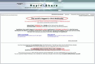
- Click on the link
- Scroll down
- Choose between Free and Premium (which, I assume, takes you to a signup page)
- Load a page full of confusing text
- Look hard for your download link
- Find the 30-second countdown until it appears
- Click the link
- Marvel at the idiocy of the World's Biggest 1-Click Webhoster.

Like the famous Charles Babbage quote, I am incapable of understanding the confusion of ideas that results in such interfaces.
It's fine to provide a premium service for paying customers, but when your approach is "make the normal one Premium, and make the free one as hard to use as possible", you are doing something wrong. Not to mention the fact that the users of this website - people sharing video files - obviously have no intention of paying for anything. If they did, they'd pay for an FTP server.

2 comments:
I'm considering a Premium subscription service for my blog. The benefit to paid members will be that I don't catch a flight to their municipality and urinate on their lawn, like I will for those who register free.
Worth every penny, too.
Post a Comment